

Story
2019 Pantone Wedding Color Palettes

Photo by Rob Sarmiento via Unsplash
Looking for inspiration for your upcoming nuptials? Consider Pantone the authority on all things color. Priding itself on its menagerie of pigments and trend forecasting proclivities, the Pantone Color Institute has teamed with WeddingWire to help betrothed couples select their palette for the big day.
An event’s color scheme sets the ambiance and tone for the celebration, making it one of the most important selections for a couple to tackle first. From table linens to party favors, colors impact every item of the event, therefore, having a cohesive palette is crucial. A party’s palette bears a purpose much deeper than aesthetics alone. Color is a powerful tool “to evoke emotion and create the special mood that a couple wishes to communicate throughout their special day,” says Laurie Pressman, Vice President of the Pantone Color Institute, in a statement.
Love in Bloom
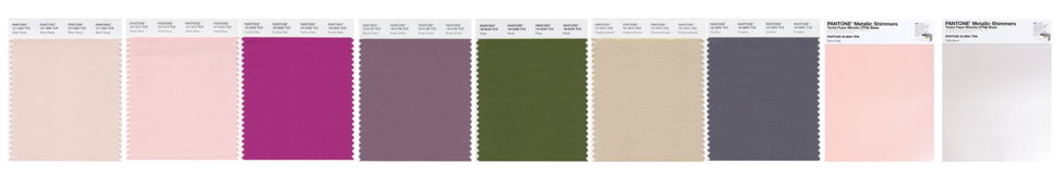
Image via Pantone
Pantone Colors: Silver Peony, Veiled Rose, Fuchsia Red, Grape Shake, Pesto, Frosted Almond, Excalibur, Rose Gold Shimmer, Cellophane
Love a great fairytale? Turn your wedding program into the pages of a fantasy as guests enter your storybook. The “Love in Bloom” palette blends soft shades like Pantone’s Silver Peony and Veiled Rose with pops of vibrant Fuchsia Red. The winsome palette emulates the enchantment of a rose garden by infusing earthy green, neutrals, a variety of pinks, and metallics together.
Incorporate fuchsia and blush flowers with shimmering metallic vases; dress the bridesmaids and groomsmen with purple and pink accents; and incorporate a wall of greenery to tie in Pantone’s Pesto green. The “Love in Bloom” color scheme is ideal for couples wanting to create an inviting atmosphere that emanates affection.
Golden Hour
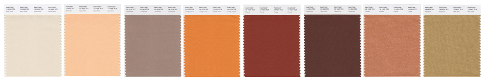
Image via Pantone
Pantone Colors: White Swan, Apricot Ice, Chanterelle, Orange Ochre, Picante, Cappuccino, Copper, Pale Gold
Pantone’s “Golden Hour” uses warm neutrals to create a ceremony that glows as great as your love. Reminiscent of a stunning sunset, this modern palette pairs pale gold and copper highlights with rich burnt orange and rust-colored hues. The earth tones are a fabulous choice for couples wishing to incorporate nature into their nuptials.
Pampas grass has become a popular medium for wedding florists, and many jump at the opportunity to incorporate the South American plant into bridal bouquets and centerpieces. Adding texture to a floral arrangement, pampas grass pairs perfectly with Picante-colored roses or Orange Ochre wildflowers. Pantone’s White Swan and Pale Gold neutrals also blend artfully for invitations and place cards.
Paradise Found
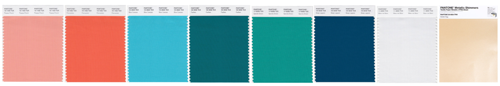
Image via Pantone
Pantone Colors: Papaya Punch, Firecracker, Blue Curacao, Fanfare, Spectra Green, Deep Lagoon, Blanc de Blanc, Golden Egg
What better way to honor Miami than with a palette made for paradise? Inspired by the tropics, Pantone’s “Paradise Found” palette dazzles with vibrant turquoise, refreshing blues, and cheerful peach. The playful colors borrow beauty from the beaches’ ocean and candy-colored sunsets, creating an uplifting and airy palette that transports guests to dreamy destinations.
Opportunities to incorporate the vacation-ready pigments can be found in every corner of the reception. The vibrant hues make brilliant boutonnieres and eye-catching bridal bouquets. Pantone’s Blue Curacao and Firecracker are convivial colors to incorporate at a bar. Craft blue signature cocktails and peachy concoctions for party guests. Then, add a fun photo booth or vibrant palm leaf backdrop to complete your tropical getaway.
Stroke of Midnight
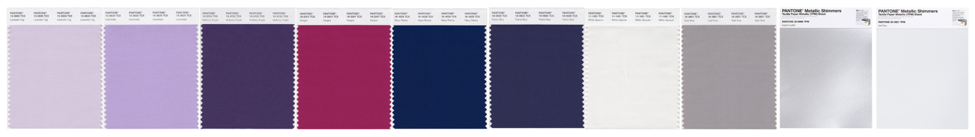
Image via Pantone
Pantone Colors: Lavender Fog, Lavendula, Mulberry Purple, Sangria, Navy Peony, Patriot Blue, White Alyssium, Opal Gray, Liquid Luster, Ice Flow
Romantic and striking, the “Stroke of Midnight” palette offers deep shades of twilight blues and captivating purples for a night you’ll always remember. According to WeddingWire, the palette was “inspired by the excitement and energy of beginning a new life with your partner.” Playing up dramatic purples and royal blues, the colors are balanced by shimmering white and dusky gray. These bold, impactful statements are replacing the dusty blue and pale pastels of yesteryear.
WeddingWire deems “Stroke of Midnight” an ideal palette for a “vintage-inspired wedding,” and we’ll second that! Incorporating retro pops of purple and navy into groomsmen suits, invitations, and even your getaway car, offer a fun nod to the past while honoring the present.